
- Log in to your Admin account.
- From the main navigation, select Content, then Channels.
- Open a course, or click Create New in a channel to start one.
- In the Course Builder, open the Elements tab in the panel on the right.
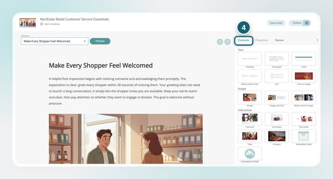
- Drag an element from the panel into your lesson to add it.
Once inside the Course Builder, you’ll see a panel on the right-hand side with all available elements.
Text Elements
Used to structure and present written content.
- Heading – Add section titles and organize your course
- Paragraph – Add standard body text
- Table – Display structured data or comparisons
- Multi-Column Text – Break content into columns for easier reading
- List – Create bulleted or numbered lists
- Text on Image – Overlay text directly onto an image
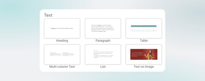
Image Elements
Used to add visuals and support learning.
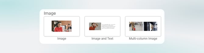
- Image – Insert a standalone image
- Image and Text – Combine visuals with supporting text
- Multi-Column Image – Display multiple images side by side
Interactive Elements
Used to make learning more engaging and dynamic.
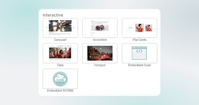
- Carousel – Scroll through multiple pieces of content in one space
- Accordion – Expand and collapse sections to organize information
- Flip Cards – Reveal additional information on interaction
- Tabs – Separate content into clickable sections
- Hotspot – Create clickable areas on an image for interaction
→ Check out Hotspot Overview to learn more - Embedded Code – Add custom code elements
- Embedded SCORM – Upload and display SCORM content
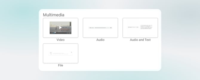
Multimedia Elements
Used to add audio, video, and downloadable resources.
- Video – Add video content
- Audio – Add audio files
- Audio and Text – Combine narration with written content
- File – Upload downloadable resources
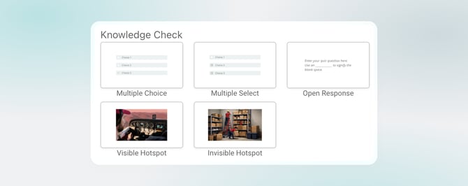
Knowledge Check Elements
Used to assess understanding and readiness.
- Multiple Choice – Select one correct answer
- Multiple Select – Select multiple correct answers
- Open Response – Allow learners to type a response
- Visible Hotspot – Clickable, visible areas on an image
- Invisible Hotspot – Hidden clickable areas for more advanced interaction
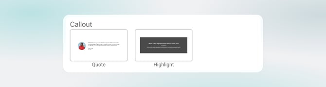
Callout Elements
Used to highlight key information.
- Quote – Emphasize important statements
- Highlight – Call attention to key points
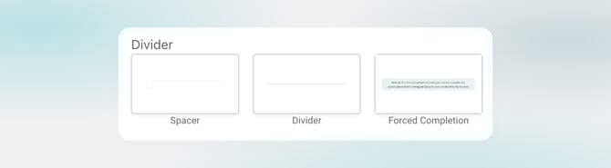
Divider Elements
Used to control layout and progression.
- Spacer – Add space between sections
- Divider – Visually separate content
- Forced Completion – Anchor progress and control how much of the course must be completed before learners can move forward
Next Step
Check out Customize Elements with Properties to learn how to style and adjust each element after you add it.