
- Log in to your Admin account
- Navigate to Content
- Select Create
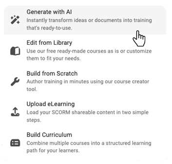
- Choose how you want to build your course:
- Create from Scratch
- Source-to-Course
- Templates
Once inside the Course Builder, you’ll see a panel on the right-hand side with all available elements.
Text Elements
Used to structure and present written content.
- Heading – Add section titles and organize your course
- Paragraph – Add standard body text
- Table – Display structured data or comparisons
- Multi-Column Text – Break content into columns for easier reading
- List – Create bulleted or numbered lists
- Text on Image – Overlay text directly onto an image
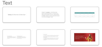
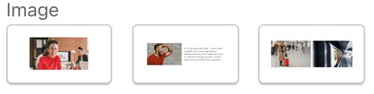
Image Elements
Used to add visuals and support learning.
- Image – Insert a standalone image
- Image and Text – Combine visuals with supporting text
- Multi-Column Image – Display multiple images side by side
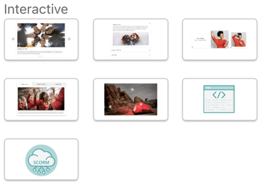
Interactive Elements
Used to make learning more engaging and dynamic.
- Carousel – Scroll through multiple pieces of content in one space
- Accordion – Expand and collapse sections to organize information
- Flip Cards – Reveal additional information on interaction
- Tabs – Separate content into clickable sections
- Hotspot – Create clickable areas on an image for interaction
→ Check out Hotspot Overview to learn more - Embedded Code – Add custom code elements
- Embedded SCORM – Upload and display SCORM content
- Video – Add video content
- Audio – Add audio files
- Audio and Text – Combine narration with written content
- File – Upload downloadable resources
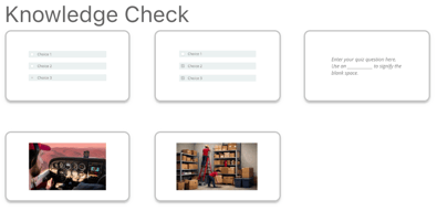
Knowledge Check Elements
Used to assess understanding and readiness.
- Multiple Choice – Select one correct answer
- Multiple Select – Select multiple correct answers
- Open Response – Allow learners to type a response
- Visible Hotspot – Clickable, visible areas on an image
- Invisible Hotspot – Hidden clickable areas for more advanced interaction
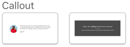
Callout Elements
Used to highlight key information.
- Quote – Emphasize important statements
- Highlight – Call attention to key points
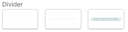
Divider Elements
Used to control layout and progression.
- Spacer – Add space between sections
- Divider – Visually separate content
- Forced Completion – Anchor progress and control how much of the course must be completed before learners can move forward
If you want, next we can:
- Turn this into a visual-friendly version for your help center UI
- Or break out things like Hotspot, Knowledge Checks, etc. into their own deeper articles (which would be very smart for linking)